Happy Halloween! Here’s a message I recorded for everyone.
A Halloween Message


Happy Halloween! Here’s a message I recorded for everyone.

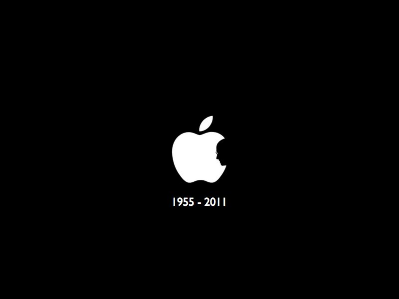
February 24, 1955 – October 5, 2011
[original design by Jonathan Mak]
——
I found a tiny version of the Apple logo with Steve’s silhouette from the Internet. I think it was from Leo Laporte’s Twitter account. I forget this guy and now he’s famous. I’m not a graphic designer but churning out the tribute image above took a fraction of a minute on Keynote. New template –> black background –> paste image –> auto center –> add text –> export to images. It made me realize how much we’ve taken for granted what Steve put on the table for people who wanted to be creative but couldn’t because of technical limitations. Now that’s something huh?
If you would like to use this as your wallpaper I have made a bigger 1920 x 1080 version. You can view it here.

So the philosophy behind the new design was that I wanted ABL 2008 to be more personality driven than content driven. That sort of required me to think about what I wanted to communicate to my readers. Eventually I had decided to stick to the vectors rather than have my face plastered all over my blog.
I really enjoyed the previous Copyblogger theme and asked Gisele to take on a similar primary palette of blacks, white and shades of reds (A Bugged Life really used whites and reds since 2006 with the old layout). I purchased the vectors of the bugs from iStockPhoto because I also plan to use them within some of my posts as lasting “characters” in this website for purposes of illustration, fun and highlight.
We added a page list on a secondary headline for more information about the author (me!). That too, is unfinished as I’m drafting a few more references and a short tutorial on “how to use this blog.”
A Bugged Life 2008 has four sets of sidebar widgets to play with. I was a believer in the two column layout but then decided to go three not because I had a lot to place in my sidebars, but because I wanted to push most of my site information up and be seen in the first 2 or 3 scrolls of the mouse. The 300×250 AdSense widget is really a placeholder. I’m planning to add a few more things for branding purposes.
The other two sidebars are, you guessed it, the two wide sidebars on top and below the columns.
Gisele is a fantastic designer. For those unfamiliar, she’s famous for her Birdie themes and merchandise. She was the one responsible for Phoebe’s Pass the Sauce, and that’s how I discovered her. Gisele is friendly, young and talented, and she’s much fun to chat with while she applies your site’s finishing touches.
The new theme has been up for about less than 10 hours. We’ve been testing this offline for the past 24 and there seems to be very little errors showing up, especially on Internet Explorer. The true beauty of the color scheme actually hits you when you’re viewing this blog on Safari.
Comments? Leave one here or in Plurk. For those who’ve left comments already, thank you very much! Thank you also to Gisele for this fabulous WordPress theme!